
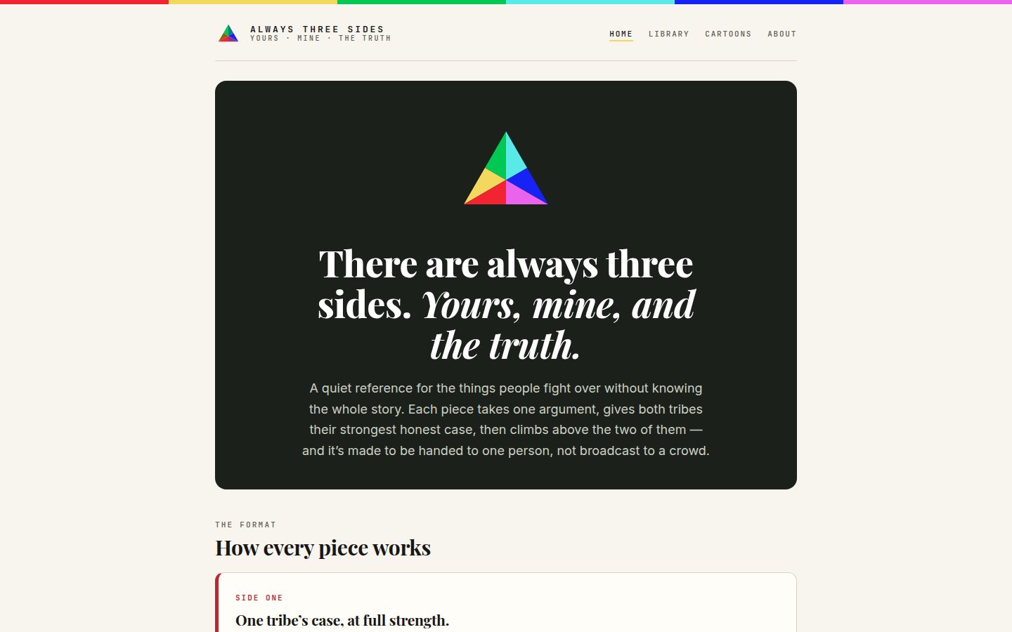
There are always three sides. Yours, mine, and the truth — and a publication built to hold all three at once.
Built to be handed to one person, not broadcast to a crowd.
This one had an unusual design brief: the format itself had to be trustworthy. If a reader can tell which side the page is on before they finish it, the piece has already failed.
- The format is the argument — every piece follows one shape — one tribe’s case at full strength, then the other’s, then a climb above both. The structure is visible on the page, so a reader can check that their side got a fair hearing.
- Made for one reader — it’s designed to be sent to a specific person in a specific disagreement, not optimised for a feed. That changed the tone, the length, and what a share button is even for.
- Restraint as a signal — a dark, quiet frame and a single colour mark. On a subject this charged, visual calm does the persuading that loud design would undo.
- A careful cutover — the rebuild replaced a live site: the old site’s real articles were salvaged first, everything was backed up before the swap, and indexability was verified after — so the new build launched without quietly losing what came before.
The same bones
You’ll read this list on every build story. That’s deliberate — the architecture is the product.
- One house theme system — a shared parent theme with a light per-site child, so every fix strengthens every site.
- Native, editable blocks — owners maintain their own pages; nothing we ship breaks the editor.
- Forms-only contact — spam-filtered forms, never a printed email address.
- Real metrics only — one lightweight measurement rail; no vanity numbers.
- Search & answer-engine ready — clean structure, structured data, and instant indexing pings on every publish.
- Type that fits every screen — one fluid typography scale across the whole portfolio.
Want your site built this way? Start a conversation.