
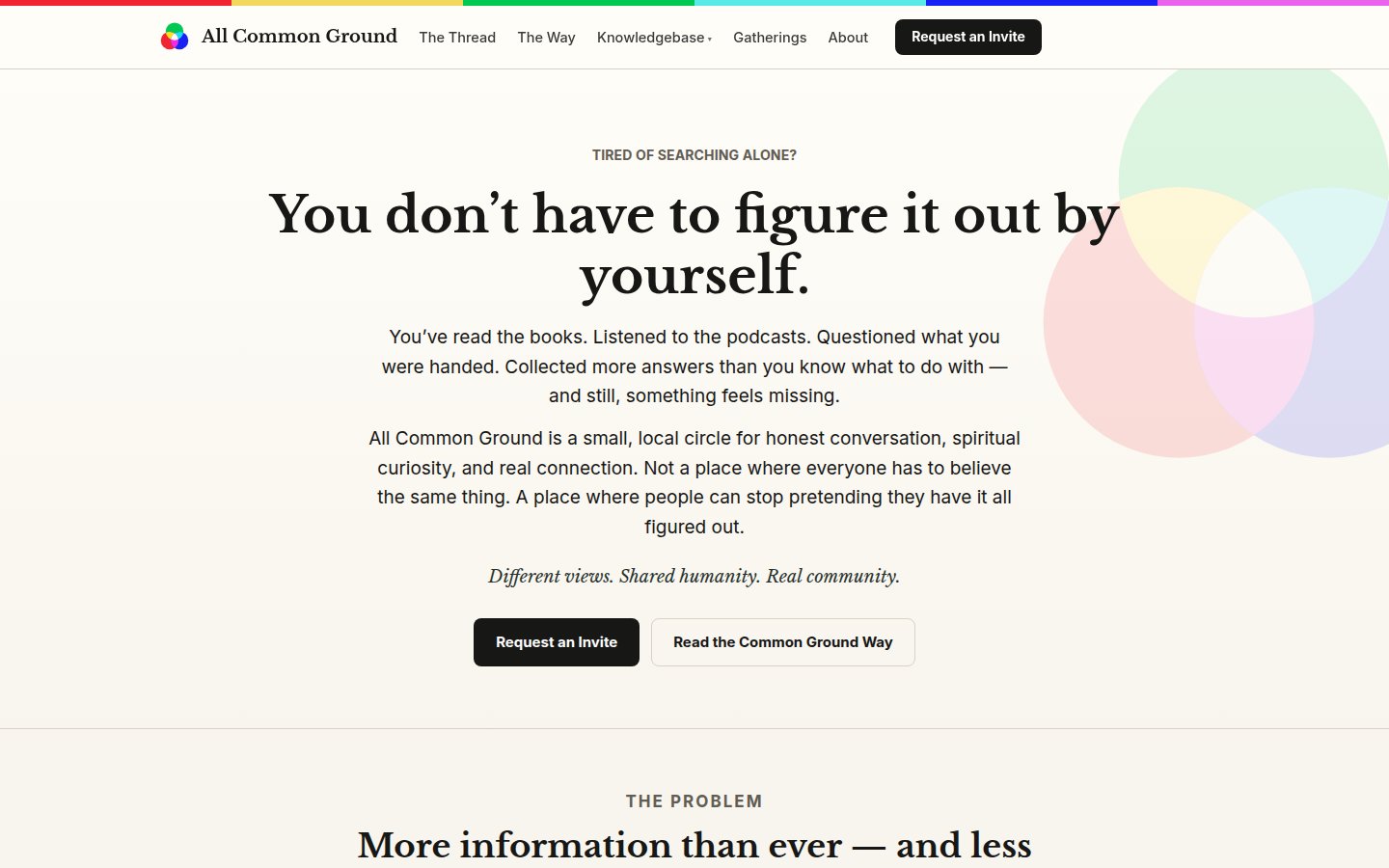
A small, local circle for honest conversation, spiritual curiosity, and real connection — and a site whose whole job is to stay out of the way of that.
A site you ask to join.
Most community sites optimise for signups. This one deliberately doesn’t — every choice runs the other way, toward fewer, realer people.
- Invite-first, by design — there’s no open signup — you request an invite through a form. That little bit of friction is the point: it filters drive-by joiners and signals that the circle inside is real.
- Quiet enough to breathe — a paper-toned, book-like design with the site’s mark used as soft background art. Nothing flashes, nothing chases you. The design’s job is to lower the temperature of the conversation.
- Questions answered plainly — a knowledgebase of question-led pages — each one self-contained, written to help someone decide rather than dump information on them.
- Built to be handed over — native blocks and standard menus throughout, so the people who run the community can edit their own site without calling a developer.
The same bones
You’ll read this list on every build story. That’s deliberate — the architecture is the product.
- One house theme system — a shared parent theme with a light per-site child, so every fix strengthens every site.
- Native, editable blocks — owners maintain their own pages; nothing we ship breaks the editor.
- Forms-only contact — spam-filtered forms, never a printed email address.
- Real metrics only — one lightweight measurement rail; no vanity numbers.
- Search & answer-engine ready — clean structure, structured data, and instant indexing pings on every publish.
- Type that fits every screen — one fluid typography scale across the whole portfolio.
Want your site built this way? Start a conversation.